1. Ignoring Your Website
Updating the visual content on your website should play a role in your social media strategy.That’s because brands like yours aren’t the largest sharers of images and videos – regular users are.
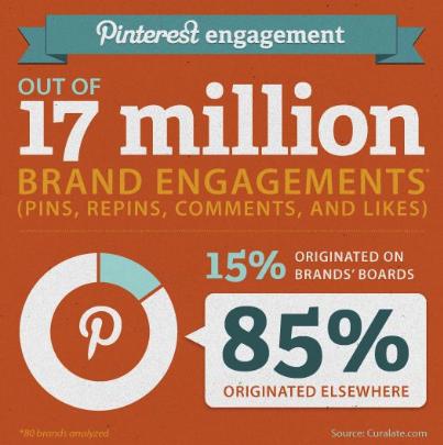
Almost 50% of adult Internet users share visual media they find when browsing websites, according to a 2013 Pew Research Center study. To boot, research from Curalate states 85% of the average brand’s Pinterest presence comes from off-board user activity:
The Tool: WordPress
The Price: Free to $299 per year
Almost a quarter of the websites you visit run on WordPress, according to the company’s data.
Along with thousands of themes to choose from, there’s a collection of publishing and media management tools to post and optimize visual content. This makes it easier for visitors find and share your photos and videos.
2. Posting Similar Images too Frequently
Stock images with inspirational quotes may earn a click from a few followers, but your visual content strategy is limited if it’s based on continuously sharing the same kinds of pictures.To increase engagement, add these visuals to your content stash:
- Screenshots: Educational pictures of your product or service in action, like this one:
![]()
- Infographics: Visualizations of data or other helpful information – typically long, but can be short and to-the-point for social
- Preview Images: Graphics that give a sneak peek at news, events or content
- Comic Strips: Cartoons, whether funny or informative, that support your messaging
- Photography: Photos that add life to visual content strategies filled with graphics – can be stock or original
- Memes: Popular image macros edited to bolster your post or reflect your brand – can certainly give your follower’s laugh
- GIFs: Looping clips that are funny and relevant to earn likes and shares
- Video Clips: Videos from YouTube, Periscope and other platforms embedded in your posts
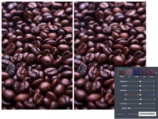
The Tool: Canva
The Price: Free! (But certain icons and elements have low fees)This online image creation suite makes design easy with its intuitive interface. It gives you a library of layouts, illustrations, grids and photographs to play with.
You can keep it simple, or use filters and play with your creation’s hues and contrast:
FYI: This blog post’s header image was made with Canva.
3. Leaving Out CTAs
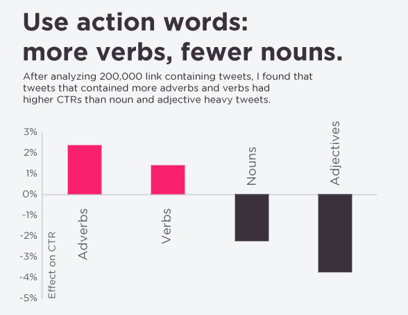
Leaving out a call-to-action (CTA) in your copy or image is a common mistake that hinders interaction. Followers often need encouragement to share or comment.The best CTAs are short and specific. They should also start with verbs (click) or adverbs (quickly), according to research from Dan Zarrella:
The Tool: Canva
The Price: Free! (But certain icons and elements have low fees) Instead of learning to use another tool for text editing, you can stick with Canva. It has an impressive collection of designs to highlight your CTA, along with simple and stylish typefaces. You can also input an RGB code to make sure your copy is the perfect colour.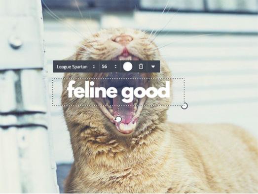
4. Going Overboard with Colour
A design with too much white space can look bare, but a busy colour palette creates its own problems. That’s because using too many bold tones makes images feel cluttered, and pairing oversaturated hues strains the eyes.Just take a look at this page:
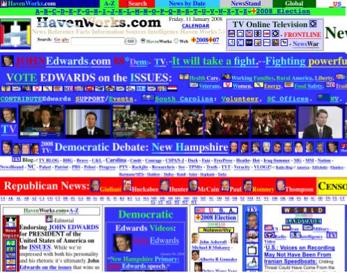
To avoid visual content that confuses your audience, stick to two or three colours and tints. Set on a neutral background tone, your choices should have enough contrast to pop and separate from each other.
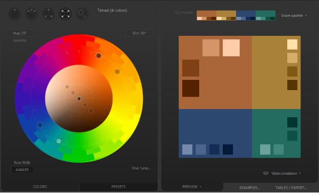
The Tool: Paletton
The Price: Free!Drag Paletton’s colour wheel cursor to create one-, three- or four-tone schemes.
5. Thinking All Typefaces are Created Equal
Choosing the right typeface can be the deciding factor in whether an image is legible or shareable.Thankfully, there’s a straightforward rule to follow more often than not: use a sans-serif typeface for digital. Sans-serif is the digital standard because our eyes typically struggle to process serifs – small strokes and squiggles added to letters – on computer and mobile device screens.
For example, copy in Times New Roman – a serif font – is slightly harder to scan than Calibri – a sans-serif typeface:

The Tool: Type Genius
The Price: Free!Type Genius was programmed to take on this design challenge.
A simple but effective tool, just select the typeface you want to start with. Then click the “View Matches” button to generate options for accompanying fonts.
Problem solved!
6. Disregarding the Platform
Ever see images that look poorly shot, cropped or designed on a brand’s social account?To optimize your images and make them pleasing to followers’ eyes, you must resize them for each platform.
Twitter needs these dimensions:
- Profile Picture – 400 x 400 pixels
- Header Photo – 1,500 x 500 pixels
- Images in Tweets – Dimensions must maintain a 2:1 ratio
For Facebook:
- Profile Picture – 168 x 168 pixels
- Cover Photo – 828 x 315 pixels
- Shared Image: 1,200 x 250 pixels
For Instagram:
- Profile Picture: 110 x 100 pixels
- Shared Photo: 640 x 640 pixels
- Thumbnails: 161 x 161 pixels
Pinterest looks best with these dimensions:
- Profile Picture: 165 x 165 pixels
- Board Display Image: 222 x 150 pixels
- Expanded Pins: 600 pixel min. width
The Tool: Pablo by Buffer
The Price: Free!Instead of remembering all those numbers, you can just use Pablo for sharing simple images.
Along with a library of pics and typefaces for your basic creation needs, the online tool will also optimize the size of your pictures for Pinterest, Instagram, Twitter and Facebook:

7. Neglecting the Rule of Thirds
Neglecting the rule of thirds can hurt the ascetic of your images. A foundational concept in photography, it also applies to videos you shoot and many graphics you design.By following the rule, your visual media will sync with how our eyes naturally scan images.
Just place a tic-tac-toe board on a picture you’re editing. Then put its key elements at a point where the lines intersect, like so:
8. Overlooking the Fibonacci Spiral
Think of the Fibonacci Spiral as an advanced alternative to the rule of thirds. A way to lead the viewer’s eye from a picture’s focal point outwards, it mainly applies to framing photos and video shots.

9. Misrepresenting Your Brand
You don’t have to use a logo to properly represent your brand. In fact, this can sometimes add clutter to your images. But without it, some social media accounts post content that lacks a clear connection to their products or services. Doing so can leave followers scratching their heads. Visual content should reflect:- What your brand stands for
- Your brand’s unique or differentiating values
- The topics your audience is interested in
Take this image from Red Bull’s Instagram account as an example:
It shows Red Bull’s connection to extreme stunts and appeals to its high-energy audience. As a result, the picture perfectly represents the brand’s reputation.
The Tool: Ingenuity
The Price: Hard work to understand your brand and audienceThere isn’t a single, all-encompassing tool to create and share visual content that reflects your brand.
It takes know-how, research and curiosity.
Pro-Tip: When starting a role as a social media marketer, read as much as you can about your new client or company. This includes websites, news articles and social media blogs. Ask your boss if there’s a set of guidelines to follow, and look into which posts have yielded the most engagement.
10. Forgetting to Measure Results
Don’t stay blind to what’s working and what’s not. Ignoring metrics is the first step in running a social media account that doesn’t generate engagement or website traffic.Based on data, tweak your visual content approach based on:
- Composition
- Posting Time
- CTA
- Hashtag Use
After some testing, you’ll discover the best design and posting strategies.
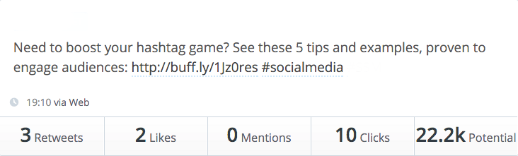
The Tool: Buffer
The Price: Free to $2,550 per yearBuffer is a popular social media scheduling tool, but it also tracks the numbers behind your posts.
For example, it measures the likes, retweets, mentions and clicks each tweet earns. It also tracks potential – the number of people who could have viewed a tweet based on who shared it, the hashtags you use and your number of followers.
Who knows – you may even find yourself in a case study about how to successfully leverage images and videos on social media!
Keyhole is a real-time conversation tracker that provides keyword and hashtag analytics for Twitter and Instagram.

